A simple, room-by-room guide to paint sheens, from soft matte walls to wipeable satin and shiny trim. Includes an easy decision guide for light, durability, ...
home decor / design / interior decoration
How to Pick Paint Colors for Small Rooms

Maya Thorne
Maya Thorne is an interior stylist and the creative voice behind Homoraa. With over a decade of experience blending vintage finds with modern aesthetics, she helps readers transform ordinary spaces into personalized sanctuaries. When she is not rearranging her living room, she can usually be found hunting for unique ceramics and textiles at local flea markets.
Created: September 29, 2026
Updated: September 29, 2026
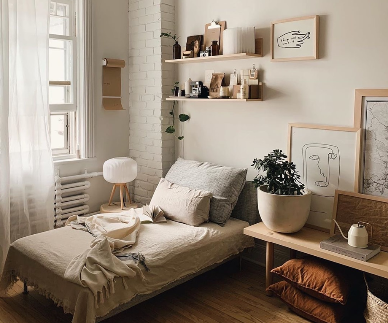
Small rooms do not need “safe” paint. They need the right paint, chosen with a little strategy. In a compact space, reflected light has a bigger impact, shadows read stronger, and the same swatch can swing from cozy to gloomy depending on your window direction and trim color.
I approach paint in small rooms like I approach styling a shelf: you’re editing for impact. When you pick a color that plays nicely with your light and your fixed finishes, the room instantly feels brighter, calmer, and more intentional, even before you hang art or bring in textiles.
Start with what cannot change
Before you fall in love with a paint name, take inventory of the elements that are staying put. In a small room, these non-negotiables are loud because there’s less visual space for them to fade into the background.
- Flooring: warm oak, cool gray tile, red-toned hardwood, or beige carpet will all pull paint in different directions.
- Trim and doors: bright white, creamy off-white, or stained wood trim changes how the wall color reads at the edges.
- Major furniture: that charcoal sofa or walnut desk is basically a big color chip living in the room.
- Countertops or built-ins: in small offices and nooks, built-ins can dominate more than you think.
Collect these cues first, then choose paint to either harmonize (soft, seamless) or contrast (crisp, defined). Small rooms can handle either, as long as it’s deliberate.
Undertones matter most
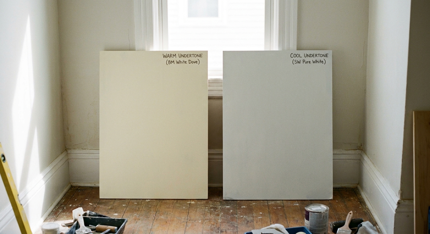
Most paint regret is undertone regret. “Beige” can lean pink, yellow, green, or even gray. “White” can look icy blue or buttery cream. In a small room, those subtle undertones are amplified by close walls and reflected light.
How to spot undertones
- Compare, do not isolate: hold two similar swatches next to each other. Undertones reveal themselves in comparison.
- Use a true white reference: a sheet of bright white printer paper helps you see whether a paint reads warm (yellow or red) or cool (blue or gray).
- Look at it beside your floor: undertones often show up strongest against wood and tile.
Undertone cheat sheet
- North-facing light (cool, blue): warm undertones often feel more welcoming, while cool grays can turn steely.
- South-facing light (warm, strong): many colors look brighter and warmer, so be cautious with very creamy yellows if you want “clean.”
- East-facing light (bright morning, cooler later): colors can shift dramatically, so sampling is worth the extra step.
- West-facing light (cool morning, golden evening): warmer evening light can make neutrals look more saturated.
If you only take one thing from this article, let it be this: choose undertone first, then choose depth (how light or dark) second.
Read your natural light
Small rooms are mood rooms. Light determines whether that mood feels airy, grounded, or slightly claustrophobic. Instead of asking “Is this color light enough?” ask “What does my light do to color?”
Do a one-day light audit
You can do this without tools. Just notice your room at three moments:
- Morning: is it crisp and cool, or warm and bright?
- Midday: do you get direct sun or soft ambient light?
- Evening: does it turn golden, or does the room rely on lamps?
Then decide what you want paint to do:
- Make it feel brighter: choose a color with a higher LRV (Light Reflectance Value), avoid muddy undertones, and keep contrast gentle. LRV is a manufacturer-provided measure of how much light a color reflects. It’s a helpful guide, though it’s not perfectly comparable across every brand.
- Make it feel calmer: choose softer, dustier tones that blur edges, especially in bedrooms.
- Make it feel larger: keep the value (lightness) similar on walls and trim, and avoid harsh cut lines.
Trim changes everything
In compact rooms, you see wall and trim together constantly. That means trim is not just “background.” It is a built-in comparison strip that can make your wall color look cleaner, warmer, grayer, or darker than you expected.
Trim approaches that work
- High-contrast trim (crisp and tailored): bright white trim around a mid-tone wall makes edges pop. Great for tiny offices and living rooms where you want definition.
- Low-contrast trim (quiet and expansive): trim that is only slightly lighter than the walls helps the eye glide. Great for small bedrooms and hallways.
- Color drenching (cozy and intentional): walls, trim, and sometimes the door in the same color. It reduces visual breaks, which can make a small room feel more continuous.
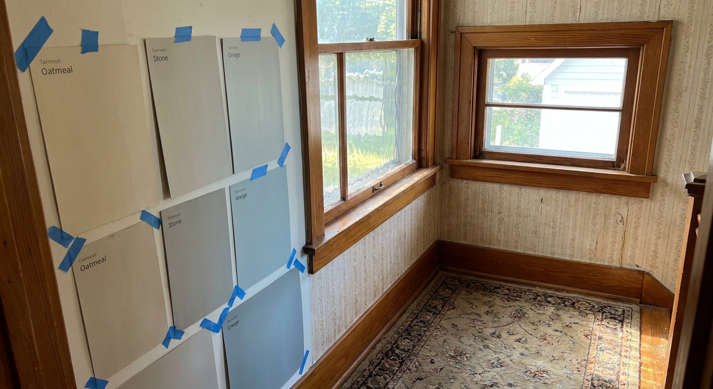
If your trim is a warm creamy white, many cool “greige” wall paints will suddenly look purple or dingy next to it. If your trim is a very bright cool white, warm wall colors may read more yellow. This is not a flaw. It is color interaction and optics doing their thing.
Sample the smart way
In a large room, a tiny swatch can still give you a clue. In a small room, you typically need a bigger test because light bounces between closer surfaces and your walls are always in your line of sight.
My favorite method: movable sample boards
- Paint two coats onto foam board or poster board (at least 12 x 12 inches, bigger if you can).
- Place the board on different walls, including the darkest corner.
- Look at it in daylight and at night with your actual bulbs on.
Why boards beat painting directly on the wall: you can move them next to trim, flooring, and furniture, which is where undertones reveal themselves most.
Try the shadow test
Stand in the doorway and look toward the farthest corner. If your sample color turns murky in shadow, it may feel smaller in real life. If it stays clean and calm, you are in a good place.
Strategies that open a room
There is no single magic shade, but there are a few approaches that consistently work when space is tight.
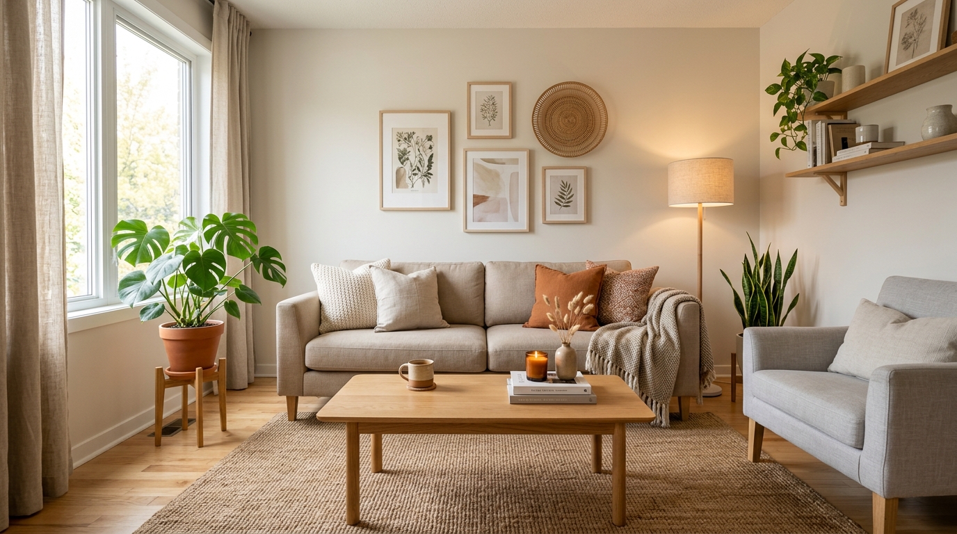
If you want this to feel more concrete, here are a few real-world pairings to keep in mind as you choose. These are not brand-specific, just dependable combinations.
- Warm off-white + warm oak + creamy trim: calm, cohesive, and forgiving in low light.
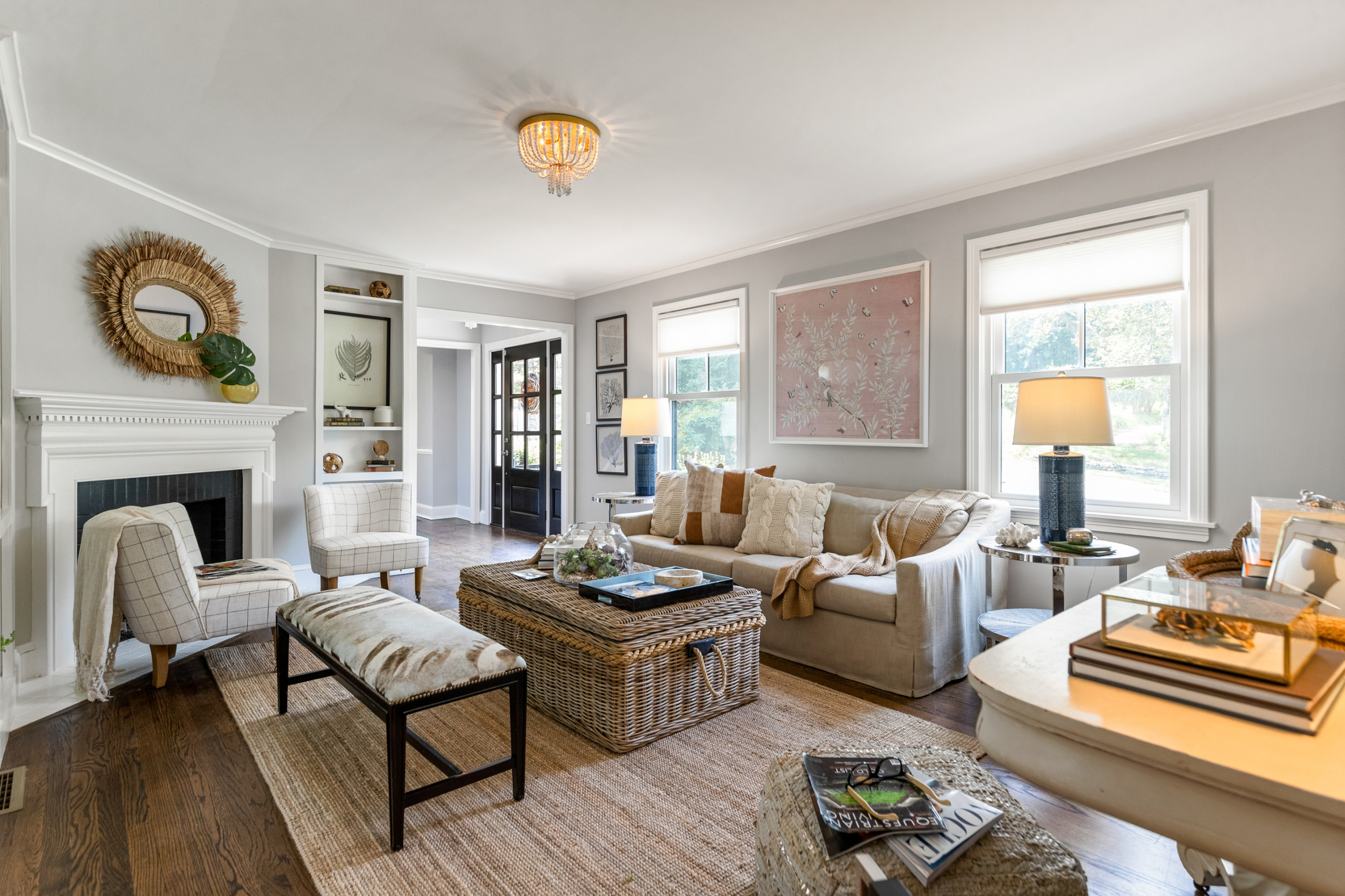
- Balanced greige + bright white trim: crisp but not stark, especially in small living spaces.
- Pale putty + beige carpet: softens the carpet’s warmth without going yellow.
- Misty blue-gray + white trim: airy in bright light, soothing in bedrooms when the undertone stays soft.
1) Soft, warm off-whites
If your goal is “bright and open,” an off-white with a gentle warm undertone can glow in low light without turning dingy. The key is avoiding anything that reads too creamy if your room already has warm bulbs and warm flooring.
2) Light neutrals with balance
Think putty, oat, pale taupe, and softened greige. In small rooms, these often feel more forgiving than stark white, especially if your walls are less than perfect.
3) Pale color washes
If you love color but fear it will shrink the room, choose a version that is diluted. A whisper of sage, a misty blue-gray, a dusty blush beige. These read as light neutrals from a distance, but feel more personal up close.
4) Mid-tone color drenching
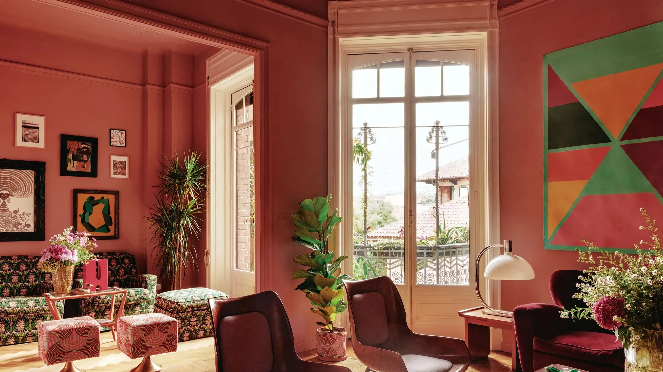
Yes, darker can work. In a small bedroom or snug office, a mid-tone (moody green, inky blue, deep clay) can blur edges and make the room feel like a destination rather than a box. The trick is layering in lighting and keeping finishes cohesive so it feels intentional, not cave-like.
Sheen and ceiling tips
Pick sheen with intention
Sheen changes everything in a small space because there is nowhere for glare, texture, or wall imperfections to hide.
- Matte or flat: softens visual texture and helps walls feel calmer. Great for bedrooms and low-traffic rooms.
- Eggshell: my go-to for most small rooms. It wipes more easily than matte but still reads gentle.
- Satin or semi-gloss: best reserved for trim, doors, and high-moisture spots. On walls, it can highlight bumps and patchwork, especially with side light.
Do not ignore the ceiling
If you want the room to feel taller and airier, a ceiling that is a touch lighter than the walls is a classic move. If you want it to feel wrapped and intentional, paint the ceiling the same color as the walls, especially when you are color drenching a small bedroom, office, or powder room. In low ceilings, this can actually feel cleaner because you avoid a hard cut line.
Room by room
Small bedrooms
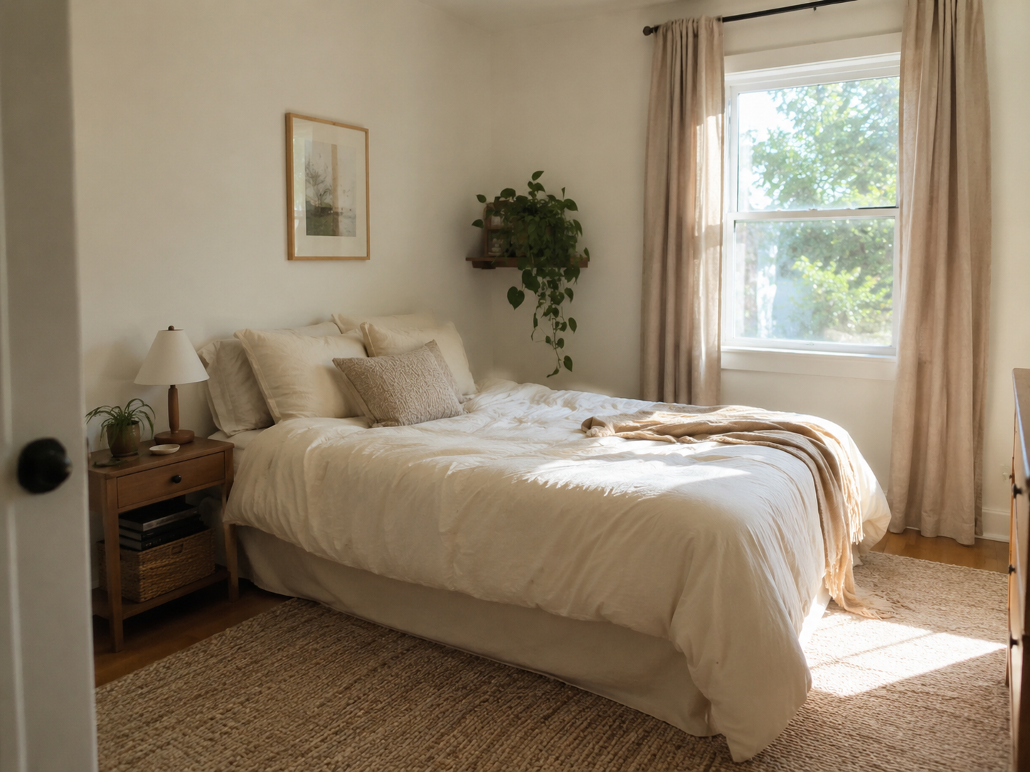
Bedrooms benefit from softness. If you want the room to feel larger, choose a low-contrast approach: wall color and trim color close in value. If you want it to feel cozy, consider color drenching or a deeper headboard wall, then keep bedding light and textured.
- Best bets: warm off-whites, dusty blue-grays, pale clay, muted sage.
- Watch out for: icy grays in north-facing light, and very creamy whites with warm lamps.
Small home offices
Offices need clarity. If you do video calls, sample your paint behind where you sit, not across the room. A color that looks calm from the doorway can look different on camera under a desk lamp.
- Best bets: crisp light neutrals, soft grays with the right undertone, gentle blue-green tones that reduce glare.
- Watch out for: strong yellow undertones that can skew sallow under warm bulbs.
Small living spaces
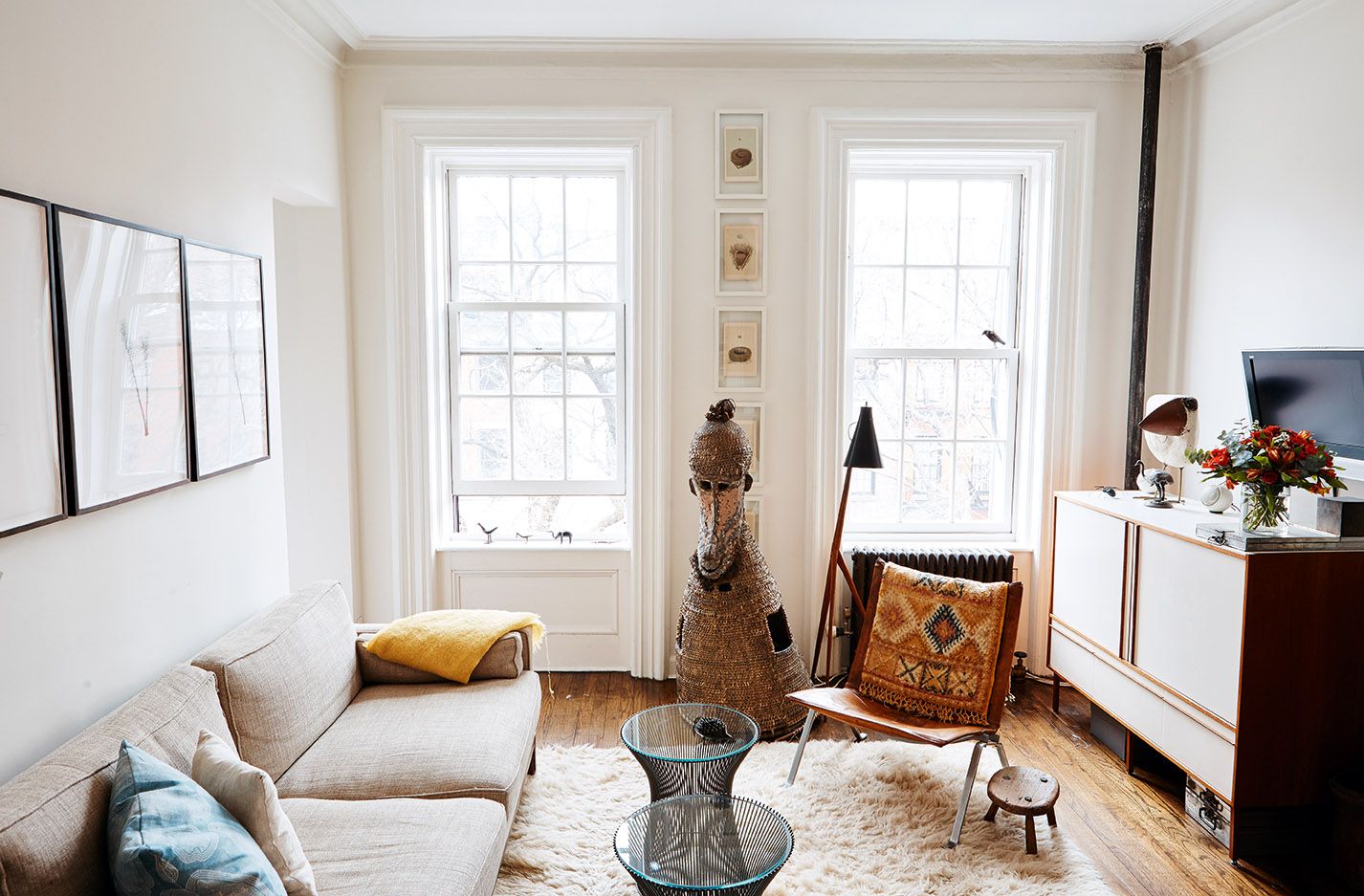
For small living rooms, continuity is your friend. If you can see into a hallway or kitchen, consider how those colors connect. A small room feels bigger when the transition is smooth, not chopped up by unrelated paint decisions.
- Best bets: balanced greiges, soft taupes, warm whites, pale olive-leaning neutrals.
- Watch out for: high-contrast paint changes at every doorway, which can make a small footprint feel busier.
Remember nighttime
Many small rooms are used most after dark. Your lightbulbs can make a perfect daytime color feel completely different at night.
- Warm bulbs (common in lamps) emphasize warm undertones and can make beige look more yellow.
- Cool bulbs can flatten warmth and make neutrals feel more gray.
- Mixed bulbs (different temperatures in one room) are one of the most common reasons a paint color feels inconsistent.
If you want your paint to feel steady, aim for a consistent bulb temperature throughout the room, then sample your paint under those exact lights.
Quick checklist
- Have I identified my room’s light direction and when I use the room most?
- Do I know whether I want warm, cool, or truly balanced undertones?
- Have I compared the paint next to my trim and flooring, not just by itself?
- Did I test with a movable sample board in multiple spots?
- Have I viewed the color at night under my real bulbs?
If you can say yes to these, you are not guessing anymore. You are choosing.
FAQ
Is white always best for a small room?
No. White can be beautiful, but in a small room it can also feel stark, especially with cool north-facing light or very bright trim. Often a soft off-white or light neutral feels brighter and calmer because it reads more consistent across shadows.
Should I paint trim the same as the walls?
It can be a great move. Matching trim to walls reduces visual breaks, which can make a compact room feel more continuous. It is especially effective in small bedrooms, powder rooms, and tiny offices.
Why does paint look darker at home than in the store?
Stores have strong, even lighting and lots of open space. At home, your room’s shadows, window direction, and nearby colors (flooring, furniture, trim) all influence how the paint reads. Sampling on a larger board in your actual light is the best way to preview it.
What if my room has almost no natural light?
Choose colors with clean undertones and a bit of softness. Overly gray or muddy shades can feel heavy fast. Pair your paint choice with layered lighting (overhead plus at least two lamps) so the color has something flattering to bounce off.