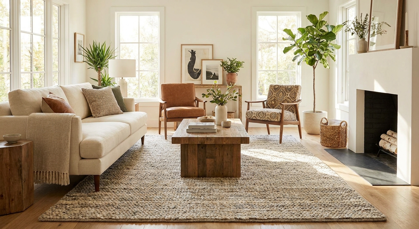
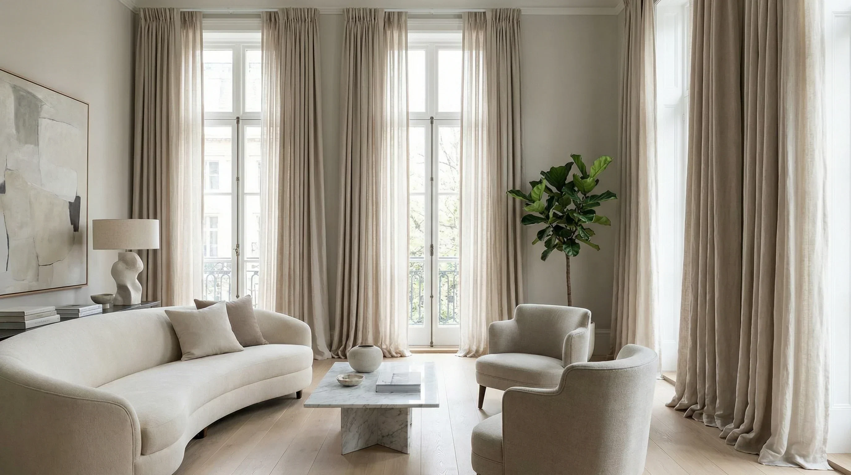
A grounded, practical approach to boho: five simple rules for layering patterns, textures, color, lighting, and meaningful finds so your space feels soulful,...
home decor / design / interior decoration
Mixing Patterns in a Living Room (Without the Chaos)

Maya Thorne
Maya Thorne is an interior stylist and the creative voice behind Homoraa. With over a decade of experience blending vintage finds with modern aesthetics, she helps readers transform ordinary spaces into personalized sanctuaries. When she is not rearranging her living room, she can usually be found hunting for unique ceramics and textiles at local flea markets.
Created: September 28, 2026
Updated: September 28, 2026
Pattern mixing is one of those things that looks effortless in a styled photo, then somehow turns into visual noise the minute we try it at home. The good news is: you do not need a “designer eye.” You need a system.
I use a simple approach that works whether your living room is tiny, open concept, rental-friendly, or already full of pieces you love. Think of it like building an outfit. One hero, a couple of supporting players, and enough calm in between so everything can breathe.
The easiest system: 1 hero, 2 helpers, 1 texture
If you want pattern without busyness, limit the number of “loud” moments. Here is my no-fail formula:
- 1 hero pattern: the largest or most eye-catching print in the room
- 2 helper patterns: smaller scale, simpler shapes, or more faded versions of the hero’s colors
- 1 strong texture (reads like a pattern): bouclé, chunky knit, leather, velvet, jute, cane, linen slub, nubby wool
- Plus solids: solids are not “boring.” They are the breathing room that makes patterns look intentional
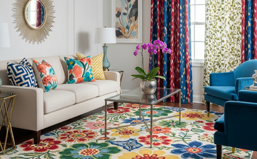
In most living rooms, your hero pattern is either the rug or the curtains. (Yes, pillows can be the hero too, but rugs and curtains set the tone fast.)
Rule #1: Keep a tight color story
Color is what makes mixed patterns feel calm. Before you worry about stripes versus florals, decide on a short color palette:
- 2 main colors (the ones you want to notice first)
- 1 accent color (used sparingly, like jewelry)
- 1 neutral (cream, warm white, greige, taupe, charcoal)
Quick add-on that matters: pay attention to value too (light versus dark). Even “matching” colors can feel loud if every pattern is high contrast (think bright white next to inky black) with no softer in-between.
Then use that palette as your filter. If a pattern is beautiful but brings in a random fourth bright color, it is often the piece that tips the room into feeling too busy.
Real-home shortcut: pull colors from something you already own and love, like artwork, a vintage rug, or even a throw blanket. Let that item be your palette “boss.”
Rule #2: Mix scales, not chaos
When everything is the same size, it competes. When scales vary, patterns stack nicely.
- Large scale: big florals, oversized geometrics, wide stripes. Best on rugs, curtains, or one accent chair
- Medium scale: classic prints like checks, smaller geometrics, ticking stripes. Great for pillows and ottomans
- Small scale: ditsy florals, tight pinstripes, tiny dots. Perfect as a quiet mixer
A simple way to remember it: one big, one medium, one small. That alone prevents the “everything is shouting” feeling.
Surface-area tip: the bigger the surface (rug, curtains, sofa), the more your eye appreciates a lower-contrast or simpler pattern. Save the punchier contrast for smaller accents like pillows and throws.
Rule #3: Use a “pattern neutral” to bridge prints
Not all patterns read as busy. Some act like neutrals because they are repetitive and restrained. These are your secret weapons:
- Stripes (especially ticking or narrow cabana stripe)
- Checks and gingham
- Herringbone
- Subtle geometrics in low contrast
- Classic vintage motifs that look slightly faded
If you want to combine a floral and a geometric, add a stripe somewhere in the mix. Stripes keep things grounded.
Mixing eras tip: if you love a traditional floral and a modern geometric together, unify them with one shared background color (both on cream, both on navy) or one repeated accent color (like olive) so the contrast feels intentional, not random.
Rule #4: Repeat one element at least three times
This is the difference between “collected” and “accidental.” Choose one element to repeat around the room:
- A color: olive appears in the rug, one pillow, and a piece of art
- A shape: curves show up in a floral pillow, a rounded mirror, and a scalloped bowl on the coffee table
- A material: warm wood shows up in the side table, picture frames, and a tray
As a helpful starting point, three repeats is often enough to make the mix feel deliberate without becoming matchy.
Living room pattern recipes
Below are a few plug-and-play combinations. Use them exactly as written or swap colors to fit your home.
Recipe A: Classic and calm
- Rug (hero): vintage-style floral rug in muted tones
- Curtains: solid linen (oatmeal, ivory, or soft white)
- Pillows (helpers): 1 ticking stripe + 1 small floral that includes the rug colors
- Texture: chunky knit throw or bouclé pillow
- Accent chair: solid upholstery (camel leather or oatmeal fabric)
Why it works: the floral does the storytelling, the stripe adds structure, and the textured solid adds depth without adding another print.
Recipe B: Modern and graphic
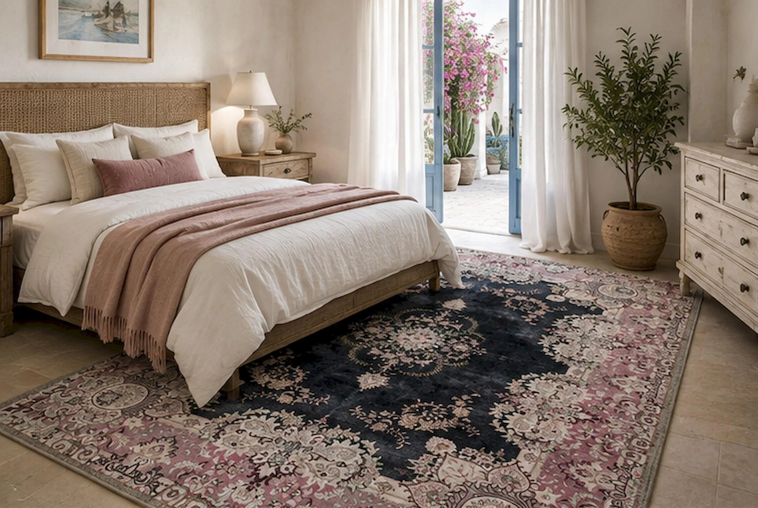
- Rug (hero): bold geometric rug (black and cream, or navy and ivory)
- Curtains: solid, warm white
- Pillows (helpers): 1 narrow stripe + 1 pillow in a tiny grid or subtle weave
- Texture: velvet pillow in a single accent color (rust, forest, or deep teal)
- Accent chair: a calm boucle or tweed in a neutral tone
Why it works: the geometric is the statement, and everything else supports it with quieter repetition and texture.
Recipe C: Cozy collected
- Rug (hero): simple patterned rug (faded medallion, subtle stripe, or low-contrast diamond)
- Curtains: small check or soft stripe (only if the rug is subtle)
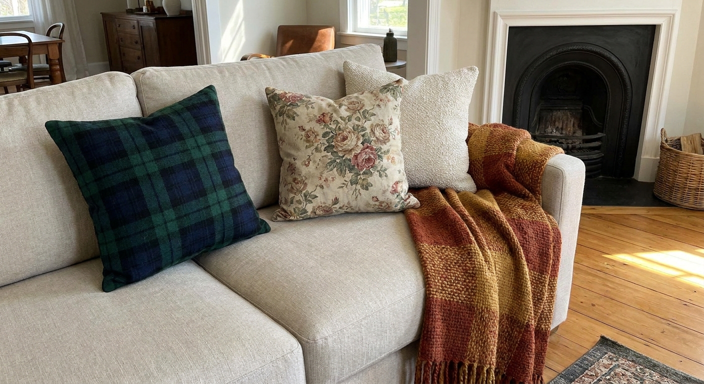
- Pillows (helpers): 1 plaid, 1 floral, and 1 nearly-solid textured pillow
- Texture: wool throw or woven basket nearby
- Accent chair: floral or plaid, but only if the sofa is solid
Why it works: one “almost solid” breaks up the prints so the room feels layered, not loud.
Where patterns work best
Stripes
Stripes are the peacekeepers of pattern mixing. They pair with florals, geometrics, and abstracts without arguing.
- Best places: pillows, roman shades, curtains, accent ottomans
- Tip: if you have a busy rug, choose a stripe in two colors only
Florals
Florals bring softness and that lived-in charm, especially in spaces with lots of straight lines.
- Best places: rugs, one accent chair, a couple of pillows
- Tip: if the floral feels too sweet, balance it with a stripe or a menswear plaid
Geometrics
Geometrics add energy, but they can read as busy when contrast is high.
- Best places: rugs, pillows, throws, framed textiles
- Tip: pick one geometric with strong contrast, then keep the rest lower contrast
Solids and textures
Texture is pattern’s quieter cousin. It adds richness without adding visual clutter.
- Best places: sofa upholstery, curtains, a grounding pillow, throws, poufs
- Tip: include at least one solid pillow in your mix, especially if your rug has a lot going on
Pillows: a simple layout
If your sofa is the pattern mixing hot zone, try this arrangement:
- Back corners: 2 matching pillows in your helper pattern (like stripes or a subtle check)
- Middle layer: 2 pillows in your second helper pattern (small floral or small geometric)
- Front: 1 lumbar pillow that is textured and nearly solid
Pro move: repeat one color across all pillows, even if the patterns differ. That single thread makes it feel curated.
Rugs + curtains: pick the star
This is where most rooms go wrong: patterned rug and heavily patterned curtains that do not share a palette.
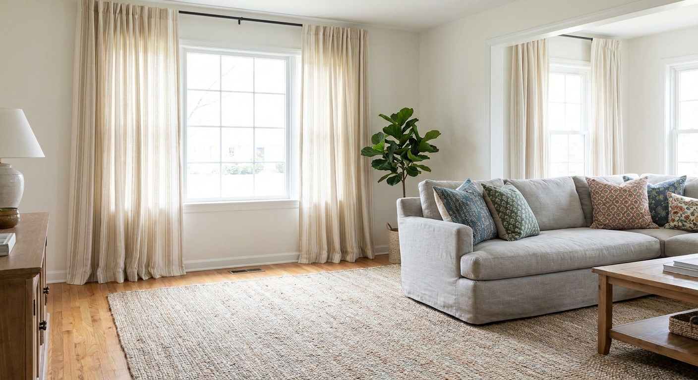
Option 1: Patterned rug, calm curtains
My most-used choice for real homes. A patterned rug tends to hide everyday life, pets, and crumbs, while curtains stay quiet and help the room feel settled.
- Choose curtains in a solid or a very subtle weave
- Pull one rug color into pillows or art so the rug feels connected
Option 2: Calm rug, patterned curtains
Great if your floors are already visually busy (strong wood grain, tile, or a small room where a rug pattern feels too dominant).
- Keep the rug textured but simple (jute, flatweave, heathered wool)
- Let curtains carry the print, then echo that print color in one pillow
Ceiling-height tip: if you want curtains to make the ceiling feel taller, hang the rod close to the ceiling and extend it wider than the window so the panels sit mostly on the wall, not the glass.
Accent chairs: choose the right scale
An accent chair is a fantastic place for a pattern because it is contained. The trick is to match the scale to the room.
- Small living room: go medium or small scale, or a low-contrast pattern
- Larger living room: a big floral or bold geometric can look amazing and intentional
- Already patterned sofa: keep the chair solid, or choose a pattern that is calmer than the sofa
If you are nervous, start with a patterned chair that includes your neutral. A cream-and-olive print feels much easier to live with than a high-contrast black-and-white.
Open concept: keep the thread
If your living room shares space with a dining area or kitchen, you do not need to repeat the same patterns everywhere. Instead, carry one small “thread” across zones, then let each area breathe.
- Repeat one color (like navy) in living room pillows and dining chair cushions
- Repeat one material (like warm wood or black metal) across furniture and lighting
- Use one pattern family (stripes) in one zone, then echo it as texture in the other (ribbed vase, reeded cabinet, woven shade)
Busy red flags and quick fixes
Red flag: too many high-contrast patterns
Fix: swap one item for a textured solid, or choose a lower-contrast version of the same pattern.
Red flag: every pattern is a different vibe
One pillow is cottage floral, one is super modern graphic, one is southwestern, and none share colors.
Fix: pick one anchor style and edit the outlier first. If you love them all, unify with one repeated color (like warm rust or soft navy).
Red flag: patterns spread evenly across everything
Fix: cluster pattern in one area (sofa styling zone) and keep the rest calmer (curtains, walls, big furniture).
Red flag: no visual rest
Fix: add a solid throw, a solid lamp shade, or a plain tray on the coffee table. Even one calm surface helps.
Slow decorating tip: test before you commit
If you are building your room over time (my favorite way), do low-commitment experiments:
- Buy pillow covers instead of full pillows
- Try a washable runner layered over a larger neutral rug
- Use removable curtain panels before investing in custom
- Collect fabric swatches and live with them for a week in different light
Your living room changes throughout the day. A print that feels “too much” at night may feel perfect in the morning. Give it time.
Quick FAQ
How many patterns should I use in one living room?
As a helpful starting point, aim for three patterns, plus solids and texture. If you want more, keep additional patterns very subtle and tied to the same palette.
Can I mix patterns if my sofa is already patterned?
Yes. Treat the sofa as your hero pattern, then keep the rug calmer and use simple helper patterns on pillows (thin stripe, small check) plus one textured solid.
Do patterns have to match exactly?
No, and they usually look better when they do not. Aim for coordination through color and scale, not identical motifs.
What is the easiest pattern to mix for beginners?
Stripes. A stripe works like a neutral and helps other prints feel more pulled together.
A final sanity check
If your living room is starting to feel busy, do this quick test: stand in the doorway and squint. The patterns that jump out first are your loud ones. Keep one loud piece, soften one, and replace one with texture. You will be shocked how quickly the room settles.
Your goal is not perfection. It is a space that feels like you, with a little rhythm and a little softness, and just enough pattern to make it interesting.